You’re killin’ me, smalls

Were the 90’s really the mecca for live action kids movies? And how much more profitable are animated movies these days?

kidsmovies_totals
 Note: The PG-13 rating did not exist until half-way through 1984.

kidsmovies_Boxoffice
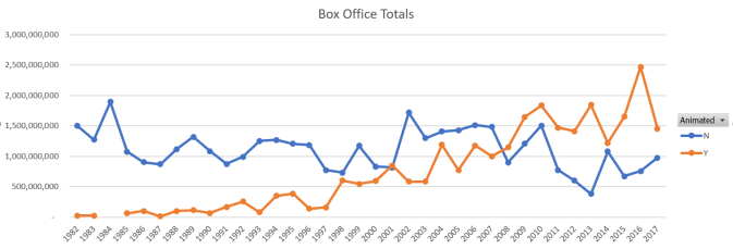
Curious what caused those huge 2016 numbers? Finding Dory, Zootopia, and Moana.

I haven’t written a post in a while because I tried creating this database of all high school mascots and that got a bit too tedious, had to find too many manually.  Still working on it, hope to finish someday.

I was thinking back to what movies I really enjoyed in my childhood in the 90’s. The Sandlot, Mighty Ducks, Casper, The Big Green, Blank Check, Andre, A League of their Own, The Rookie, Now and Then, Matilda, Home Alone, Heavyweights, Toy Story, Camp Nowhere, Free Willy. The list goes on and on. Notice that they’re all live action, except for Toy Story? The 80’s and 90’s had a ton of good live-action kids movies. Nowadays, it seems like there are way more animated movies and a lot less Mighty Ducks. Were the mid-90’s really the mecca of live action kid movies? I set out to find out if this is really true.

At first, I started combing the internet manually, putting together lists of kids movies per decade. I also wrote SPARQL, the query language for wikipedia, to pull down movies with the genre “children’s film”. I looked at trailers and synopses to determine if a movie could be branded a kid’s movie if it wasn’t obvious to me. There were some tough dilemmas, like Now & Then is rated PG-13 but as an 11-year-old, I loved it and it featured kids around my age. Is that a kids movie? I think so, but the rating disagrees.  What about PG romantic comedies, like Sleepless in Seattle? In the end, this proved too cumbersome, especially considering there are way too many movies in the 1980s and 2000s that I was not familiar with, so I started all over. I resorted to simply copying down lists of movies from the site boxofficemojo. You can get lists per year and rating, so I took down all the G and PG-rated movies for each year, 1982-2017 (1982 was the earliest year using the aforementioned filters).  I then marked which ones were animated, which took a bit of time, but at least it was an unambiguous task, I thought, until I ran into movies like Space Jam, Hop, and the Muppet movies. I decided to label those live action.  Of course, I wouldn’t call all PG movies “kids movies”- there are definitely a lot from the 80s that looked like adult movies to me- but I figure this is good enough criteria to answer my research question without spending a million hours.

The first graph shows simply the number of movies rated G or PG per year, broken up by animated or live action.*  The second shows their box office numbers. As you can see, animated movies are becoming more common and raking in a ton of money for movie studios, while live-action G/PG movies are on the decline. There were 67 live action G/PG movies 1984 and it has slipped a lot since then, with only nine being released in all of 2013! One thing to consider is that the PG-13 rating did not exist until part way through 1984 and something that was G back then wouldn’t necessarily be G now.  The fact that you see a sharp drop off in PG movies after 1984 can attributed partly to this. There was a bit of a peak in the mid 90’s, during the height of my childhood (I was born in 1986), like I suspected.  I grew up on live-action movies and to this day, don’t care as much for animated movies, but I know that’s not true for everyone my age.

Continue reading

States With Most Private School Students

privateschools
Click to enlarge in a new tab

I went to a fine suburban public school, but sometimes I wondered what it would be like to go to a fancy private school with a fancy sounding name like The Summit Country Day School or The Seven Hills School (the “the” in front is how you know it’s fancy). Those are two of the most expensive and top-rated schools in Cincinnati, which run just over $20,000 a year. That doesn’t have much on New York City private schools, like Dalton, Marymount, or the Ethical Cultural Fieldston School, the latter of which is $47,000 a year. Cities like Cincinnati, where I live, are full of Catholic schools. We have 7 all-girls, 5 all-boys, and many co-ed Catholic high schools in the greater Cincinnati area. So I was curious- where are there a high percentage of private schools? Would NYC or somewhere in the Northeast top the list?

I ran this analysis of the percentage of private school students using both the state population and the total number of students (public + private) as the denominator (the results were pretty similar, but note how DC goes down a lot further, relatively speaking, in the bottom graph).  DC has the highest private to public ratio of students and Utah and Wyoming are among the lowest.

Continue reading

NCAAW Basketball (part 2)

basketballstats2

Click to enlarge in a new window.

Finally, part 2 of my women’s NCAA Basketball stats. The above data shows which states the players from the top 15 schools hail from (at end of 2016 season). Texas soars to the top with 20, followed by 12 from Ohio, and 9 from California and Georgia.  But don’t forget that the University of Texas and Baylor are in the top 15, and Ohio State is as well, and they recruited a lot of Ohioans. California has UCLA and Stanford. Georgia doesn’t have any schools but have a few close by- South Carolina, Florida State, and Tennessee. So that begs the question- are these schools so good because these areas are hotbeds for basketball talent, or are these athletes a bit lucky to live in an area with a top program, or a bit of both?  UConn has been the #1 team for years and they consistently recruit far from Connecticut for their top players. However, they, like most teams, have more local players filling out their roster, which explains some of the results.

The tables to the right show analysis I did combining my Athletes data with my Schools data to answer the question- do players come from wealthier towns, and therefore likely wealthier families? By using school data on the number of students on free or reduced lunch, I bucketed all 99,000 public schools in my data set into 5 equal-sized buckets. Level 1 is the poorest schools, or the bottom 20% (highest percentage of free/reduced lunch), and Level 5 is the top 20%. 43 of the athletes were in Level 5, and the numbers keep decreasing through Level 1. So the answer to my question is yes, players are, on average, coming from richer public schools. And just for fun, I also ran their private schools through and found that the majority went to Catholic school, but that’s no shock given the sheer number in this country.

For reference, the top 15 schools at the end of 2016 were (in alphabetical order): Arizona State, Baylor, Florida State, Kentucky, Louisville, Maryland, Notre Dame, Ohio State, Oregon State, South Carolina, Stanford, Tennessee, Texas, UCLA, and the University of Connecticut.

USA Olympians on Instagram

USA Olympians Ranked by Growth in followers during August
topgrowth

I’m a huge fan of the Olympics and hold a party every time to watch the Opening Ceremonies. I thought it would be fun to see which athletes at the 2016 Rio games had the most social media followers and which ones saw the most growth in followers during the Games. The list above is all the USA Olympians who saw their Instagram follower counts double after the Games were over (only those with at least 4000 followers were included). The list below is the top 20  with the most followers regardless of growth. Male basketball players feature prevalently, not to my surprise. But it was nice to see Serena and Alex Morgan up there in the top 5 along with Simone Biles at #7.

top20totals

Continue reading

NCAAW Basketball (part 1)

bball_stats

I compiled statistics on the top 15 women’s college basketball teams during March Madness this year using their rosters. I calculated the average height for each team as well as figured out who the shortest and tallest players are. The shortest stands at 5’3″ and the tallest two are 6’7″. While UConn was the number one team, it ranked 12th in height out of the 15 teams I analyzed.  I also did some race/ethnicity statistics based on their photos and articles I found, so it is by no means an exact science since it’s not like they list that in people’s bios (also note that if they are half non-Caucasian, they tend to be listed as the non-Caucasian race/ethnicity). All the rosters list the women’s high schools, so I was able to see what percentage go to public versus private school or homeschool. The majority are public schooled (72%).  The 19 “Blank” entries represent the 18 international students and 1 homeschooled student- Moriah Jefferson of UConn.  In addition to AAU, Moriah played for a homeschool team in Texas during the winter season.  Florida State has the most international players of any team.

On the next post, I’ll share some other interesting stats and charts, like which states these athletes come from as well as analysis using the schools they came from.


Christian Book Overload

Disclaimer: The data in this post is approximate and not 100% verified or factual.
books_by_pastor

Click the chart to enlarge

I did a previous post on the Top 20 Megachurches and noticed while researching the pastors that, boy, have they written a lot of books! Holy cow. I thought it was just Joel Osteen, but I was wrong. The graphic above is the approximate number of books written* by the pastors of the top 50 megachurches according to one ranking list I found**. 476 books total! How do they have so much to say to write 10, 15, 30 books?! And are they writing these during work time when they should be doing other things for their church? Are they getting rich off these books? Tons of the these churches or pastors have an online store on their website to sell the books and dvds and study guide companions, which is a huge turn off for me. The whole thing just made me groan. It’s such a business and kind of feels like a scam. I doubt Jesus would have wanted it this way.

Continue reading

Serena versus the world

PointsPerCountry

Above is a graph showing the ranking points by country for the top 100 women players on the WTA tour as of August 10, 2015. As you can see, the United States is the clear #1 with over 25,000 points (for reference, winning a grand slam like Wimbledon nets you 2000 points; a large event like Cincinnati’s Western & Southern Open gives you 900, and an ITF event (the minor leagues) adds around 50-150 points). The WTA uses a rolling 12 month point system so you never reset to zero (the ATP tour, the last I checked, does reset each year in January).

I made some more cool visualizations with Microsoft’s Power BI technology that shows there’s more than meets than eye when evaluating which country is dominating. Continue reading

Names with Biggest Increase in Popularity

So, it’s been forever since I posted. Got busier at work, the weather has been nice and I’ve gone on several trips- typical excuses. But I hope to get back to some more regular posts!

The 2014 baby names were released and I hope to load them into my database soon. In the meantime, here’s a fun list of names that saw dramatic increases in the last several years and to what or whom that can be attributed.  I compiled the list by calculating which names saw the largest percentage increase in a two year timespan, filtering out very rare names, alternate spellings and only looking at the last 10 years. Here are the top 10…

Name Year Count 2 Years Prior* % Increase Reason
Cataleya F 2012 636 < 5 31,700% Female assassin in movie Columbiana
Jaslene F 2008 872 5 17,000% Winner of America’s Next Top Model Season 8
Kanye M 2004 507 5 10,040% Rapper Kanye West
Rihanna F 2006 571 6 9,400% Singer Rihanna***
Allisson F 2008 767 12 6,300% Mexican TV star Allisson Lozz
Talan M 2006 1058 20 5,200% Reality star on MTV’s Laguna Beach
Audrina F 2007 412 8 5,000% Reality star on MTV’s The Hills
Akeelah F 2006 403 8 5,000% Movie Akeelah and the Bee
Marely F 2008 1004 21 4,700% ?
Miley F 2007 1232 26 4,600% Actress/singer Miley Cyrus from Disney’s Hannah Montana****

*If the name did not appear in the database two years prior, I assigned it a value of 2. It’s hard to say whether it had zero names or up to four names, so it was a compromise. Plus assigning it at 0 made the percentages seem ridiculously high**- it would have been 63,000%  for Cataleya, for example.
**Because 31,700% isn’t ridiculously high at all. 🙂
***Her real name is Robyn Rihanna Fenty
****Her real name is Destiny Hope Cyrus

Average Age of Marriage

I just turned 29 and that got me thinking about how I’m probably now older than the average age of marriage in the US for women (I turned out to be right- it’s 27). So I went googling around and came across this Wikipedia page listing the average age of marriage around the world in many countries. I was pretty surprised at how high the age is for countries like Sweden, Iceland, and Denmark. Men are nearly 36 for their first marriage in Sweden! That’s crazy to me. For women, it’s 33, which is beyond the age of easily being able to have children (many doctors consider pregnant women beyond 35 to have geriatric pregnancies or be in “advanced maternal age”). I have visions in my head of tons of young, single Swedes living up their 20s partying and doing whatever and not settling down.  On the flip side, none of the countries had a very low average. Iran, India and Indonesia were all about 22. China’s average age has been going up and they have to deal with a country full of a disproportionate amount of young men. I found this article about “leftover women”, so despite what you’d think, not all women are easily snatched up. As countries industrialize and women obtain college degrees and enter the workforce, the age has gone up. Are there consequences to this? According to this New York Times article, in general, women who delay marriage have higher incomes, but it’s the opposite for men.  Marrying later leads to stresses from fertility issues, unhealthy babies, and not getting the family that you wanted. Plus by the time you become parents, your parents are really getting up there in years and not as available to help.

I came across this interesting blog post that examines the myth about whether people really did get married very young in the old days.

Check out this map showing the average ages per country. There are lots of other nifty maps to check out as well, like where in the world you can find the most plastic surgeons (spoiler alert: it’s the United States, duh). Not so sure of the accuracy of these maps because when I clicked on World Religions, the map showed Christianity as the majority religion in North Korea, which I kind of doubt.