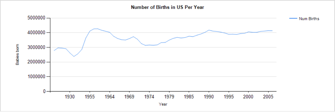
This chart shows the number of births in the US per year. Interesting to see the baby boom in the 1950s and early 60s visualized here and how the number of babies born today is about the same as the baby boom peak- was not expecting that (thought there would be a higher number of births). In 1961, nearly 4.26 million babies were born. In 2009, there were 4.13 million births. This graph helps me feel semi-comfortable about making name trend graphs by using count of babies born, rather than percentage; for example, if the number of babies born now was twice as high as several decades ago, then that would not be very accurate.
Click to enlarge.
